Moto GP Style Guide
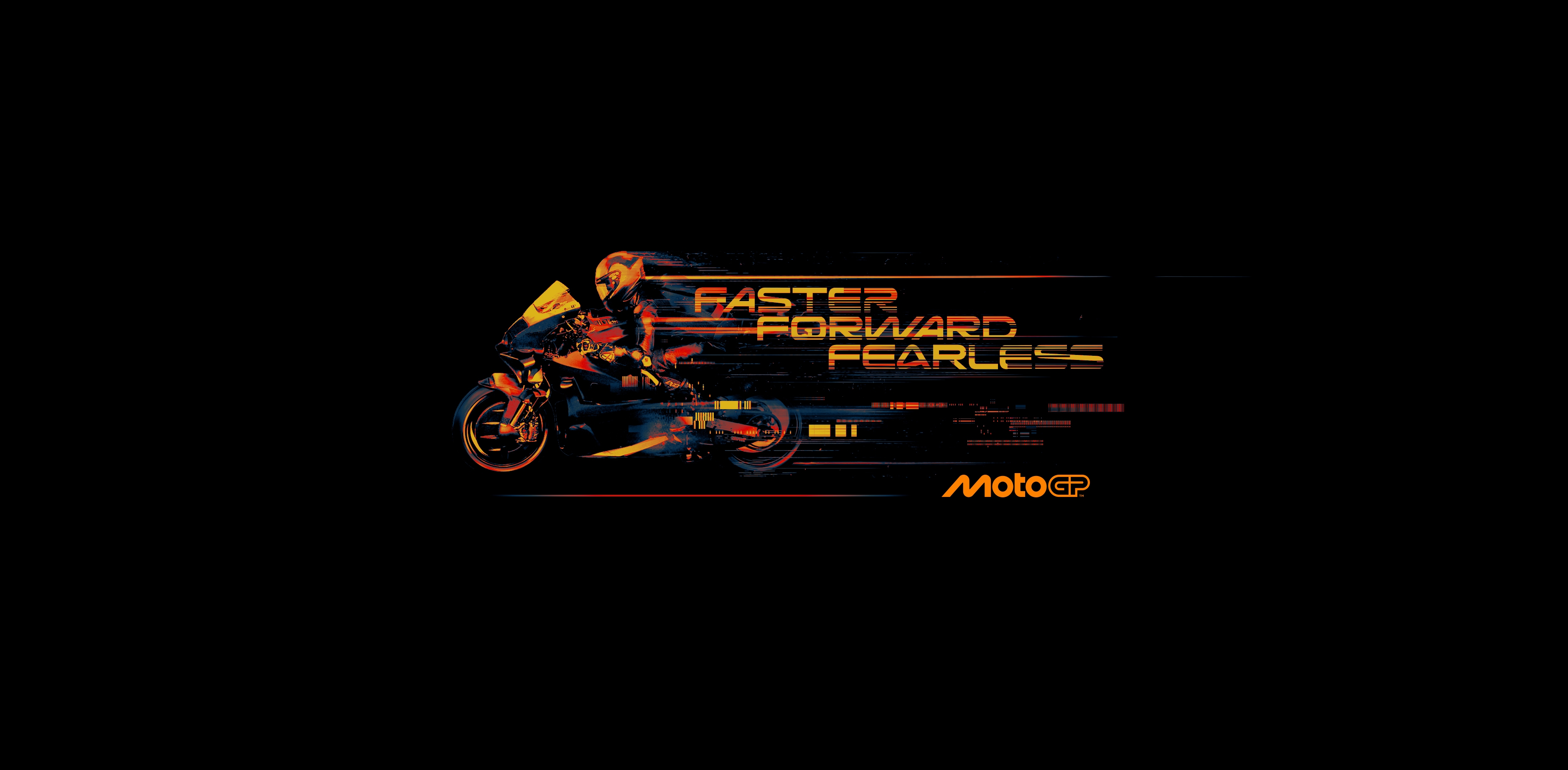
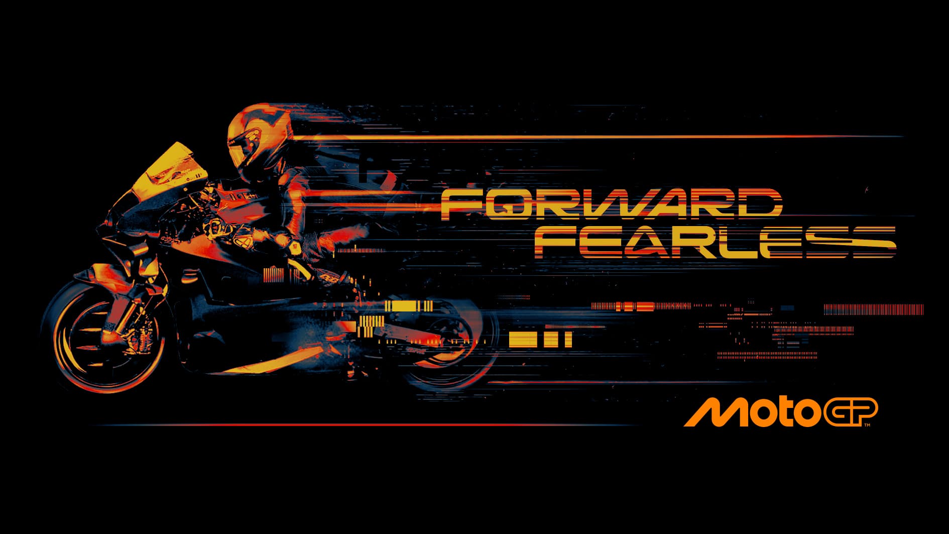
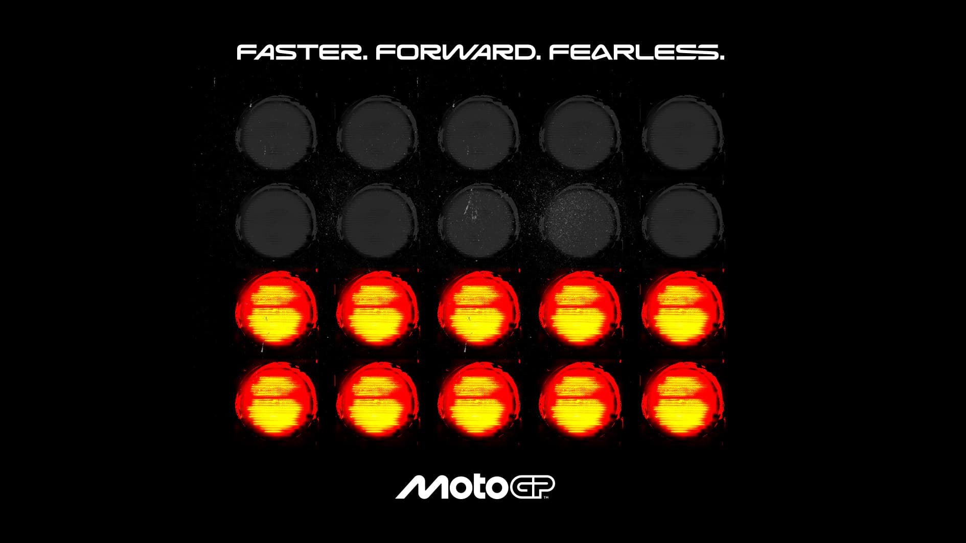
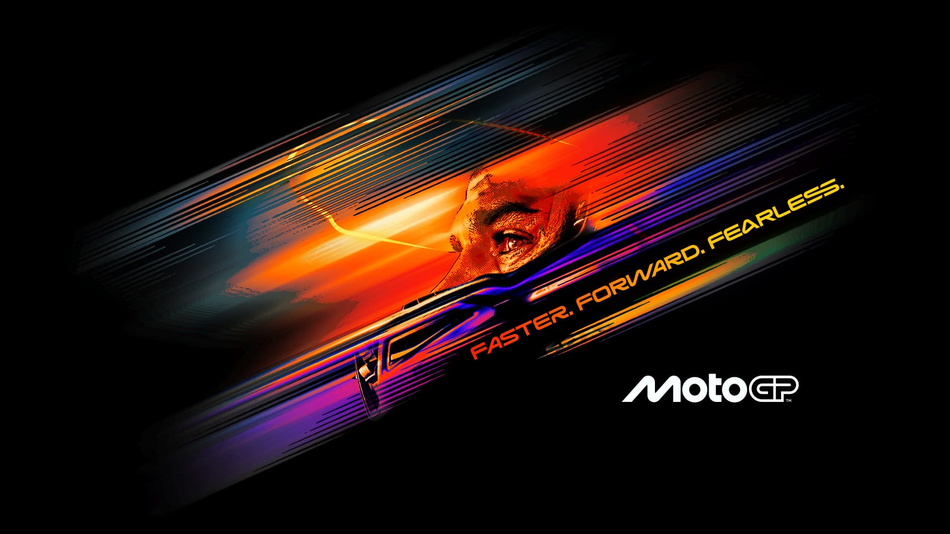
MotoGP’s new branding is a stunning masterpiece embodying the sport’s DNA: elegant curves of the GP reflect the curvature of the racetrack, the M mirrors the pace and posture of riders in motion, and the OOs echo the wheels of the bikes themselves. Three creative parameters overarch the core branding - Lean, Blur, Stretch - forming visual pillars which underpin every execution and run through each aspect of the resulting brand universe.
MotoGP turned to Fluid to codify their incredible new identity in a comprehensive style guide - a brand bible that would ensure the perfect blend of flexibility, ownability and continuity across every execution, in every medium and marketplace worldwide, from CP to apparel, digital media and beyond.
The guide ensures each creative iteration sings with the same clarity and consistency as the initial MotoGP brand identity, allowing users to apply the brand’s visual assets in a way that is consistent yet versatile.
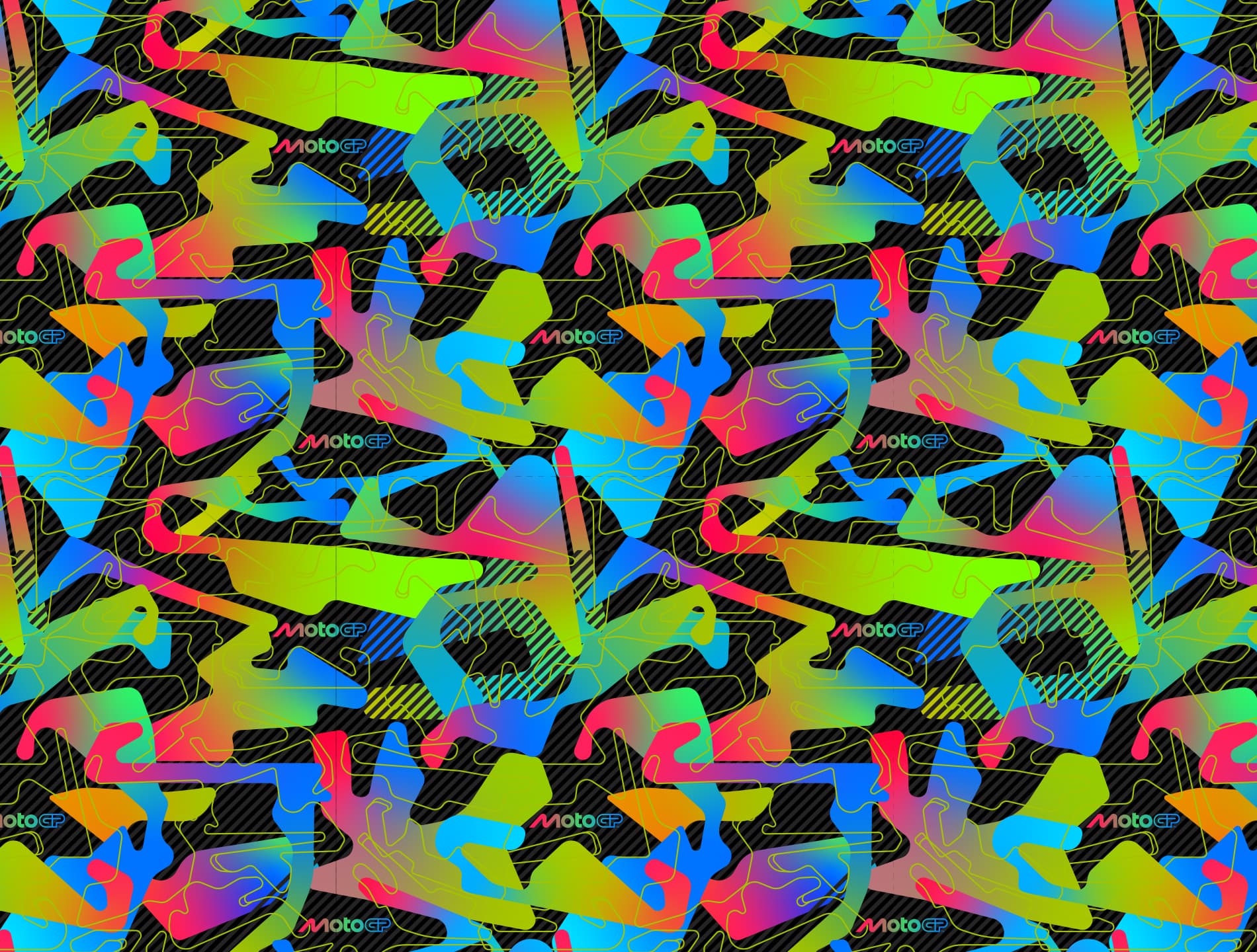
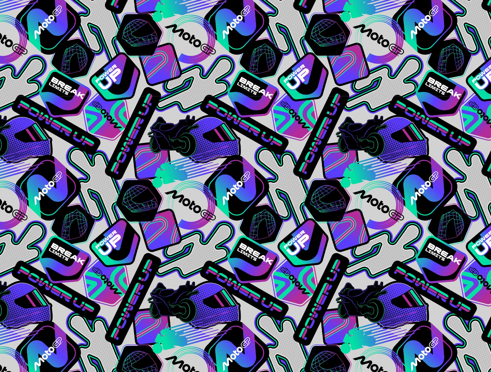
Our style guide is organised into three collections, each designed to meet the needs of different audiences and contexts, while staying true to MotoGP’s core. Designed for the purist - the fans who watch every race, and live for the sport’s DNA. Here we retained the core colour palette and aesthetic, then layered in new elements that tie the “lean, blur, stretch” parameters to the physicality of the track, reflecting and incorporating asphalt textures, grid markings, and track geometry.
Huge shout out to our illustration genius Justin for crafting stunning, elegant artwork. The result feels raw, authentic, and deeply connected to the sport, but elevated with subtle design flourishes that the most dedicated fans will notice and appreciate.
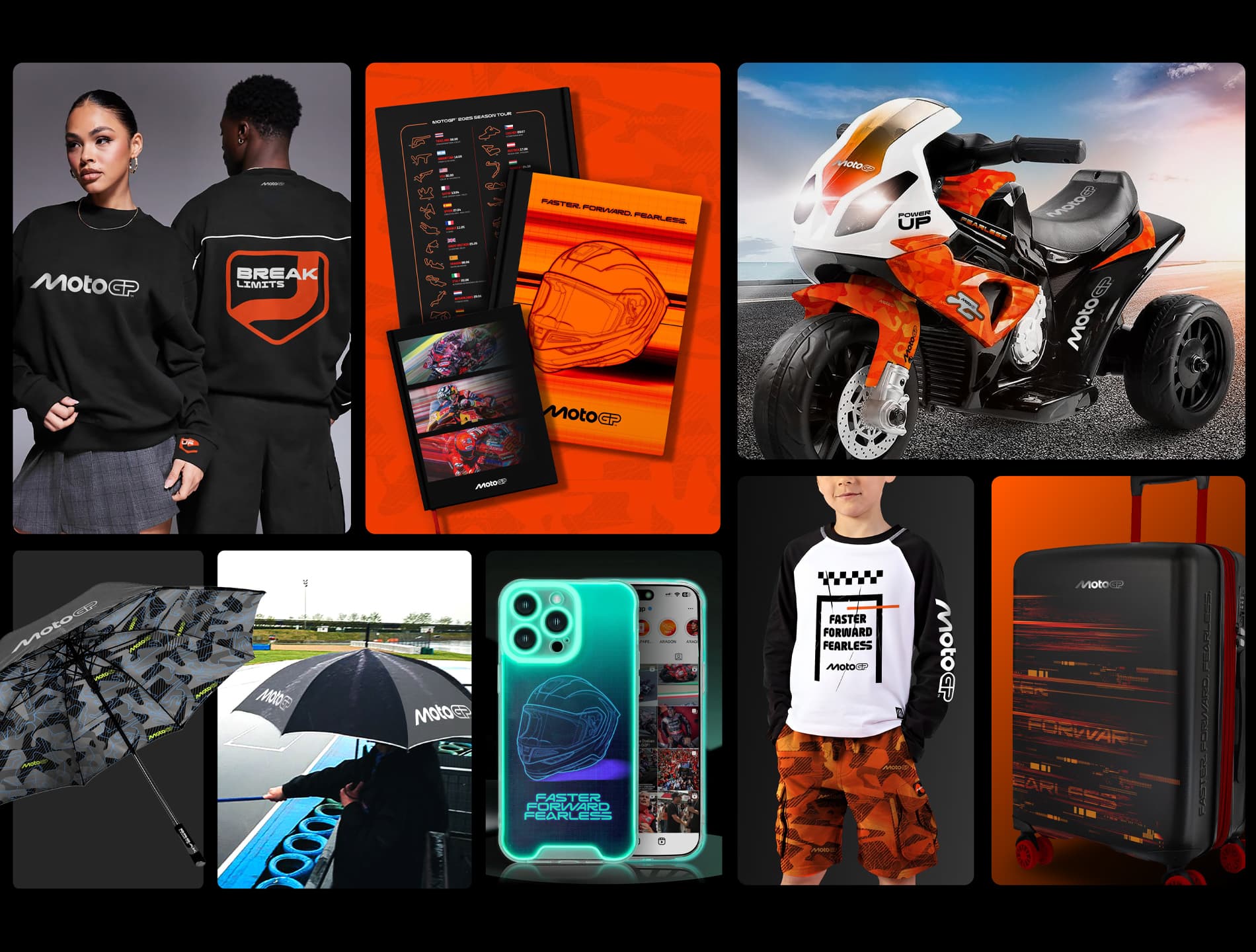
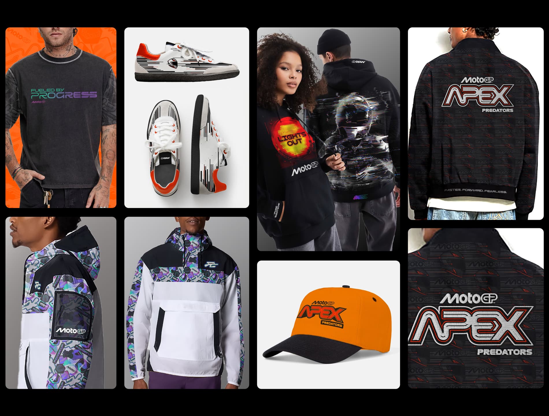
Here, we elevate the creative toward fashion and lifestyle. Pops of magenta add energy and trend-led appeal, with typographic treatments echoing the curvature of the racetrack.
Within the tight framework of the brand guidelines, we explored subtle palette shifts, material textures, and design progressions to create a look that retains MotoGP’s ownability while also resonating on a more consumer level, broadening appeal beyond the core fanbase. The result is stylish, contemporary, and perfectly pitched for lifestyle and retail applications.
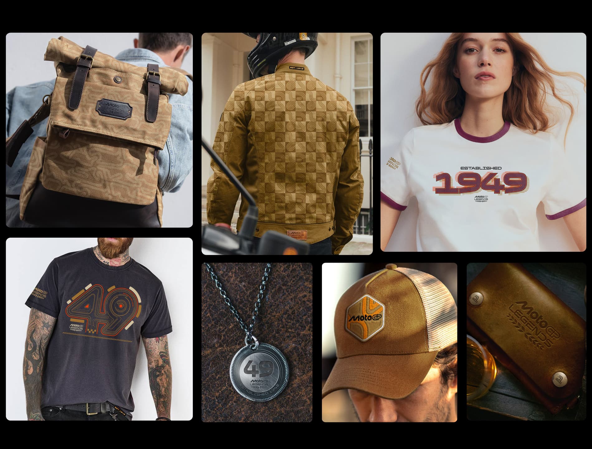
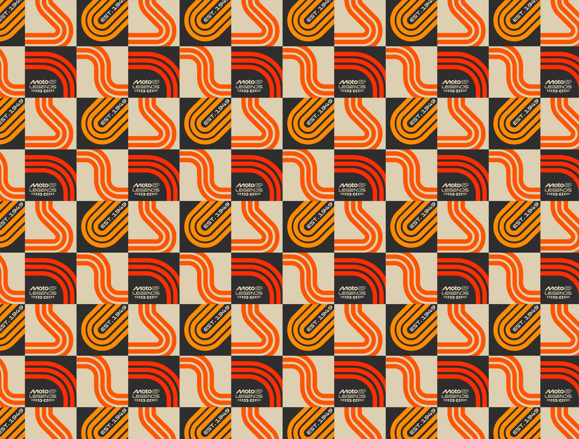
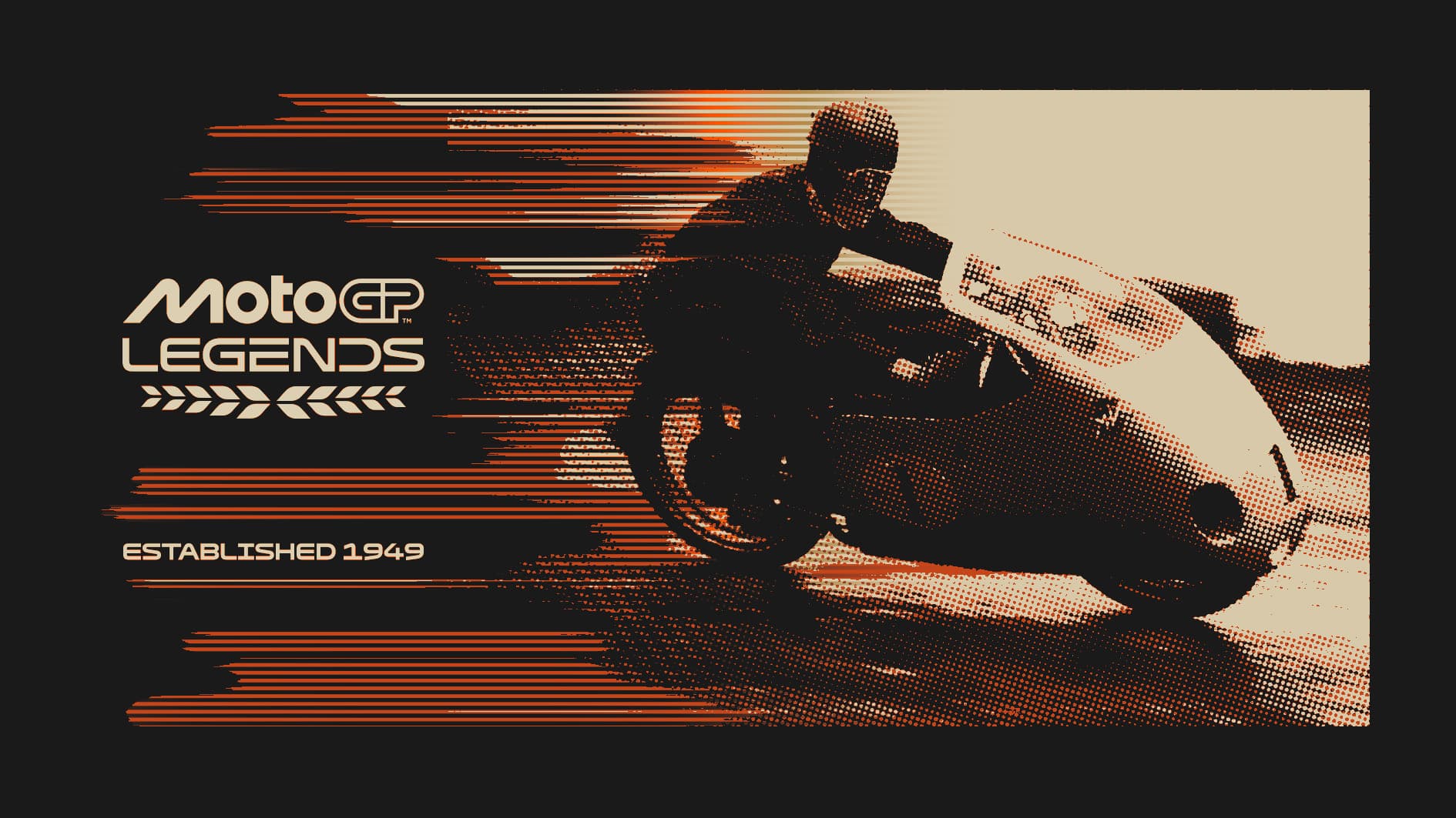
The Legacy collection draws directly from MotoGP’s heritage, appealing to those for whom nostalgia and history resonate most. Sepia tones, vintage leather textures, and muted neutrals are paired with the core brand colours, while accents of deep wine bring a mature evolution of the magenta used across other collections. The aesthetic is simple, authentic, and timeless, celebrating the icons and culture of motorcycling through the years.
The MotoGP project was a true case study in the Fluid team’s dedication to precision, creativity, and brand stewardship, delivering a stunning body of work that captures MotoGP’s spirit both on and off the track, past and present.


